Data Visualization


Introduction
“The greatest value of a picture is when it forces us to notice what we never expected to see.” John Tukey, Exploratory Data Analysis, 1977
Data Visualization makes data easier to understand. It is the representation of data in graphs, charts, images, and video. Software applications provide a means to create data visualizations and data dashboards—interfaces that allow us to visually explore and analyze data.
Visualizing data helps us view and understand something that is inherently not visual and potentially difficult to read. A single image can provide a way to explore and make sense of small to big data and open the possibility to “notice what we never expected to see.”
Data Visualization has become an indispensable tool to understand data. Computers and networks have transformed data from something that was once difficult to collect and use, to something that is abundant and easy to access. We are in the era of Big and Open Data, and researchers and data analysts help to make this data visible and therefore widely accessible.
Some fields closely related to Data Visualization include:
- Information Visualization (InfoViz)
- Information Design
- Data Storytelling
These fields build upon the analysis of data and Data Visualization with respect to taking visual representations of data and crafting them into more easily digested visual formats for professionals and the public at large.
Examples
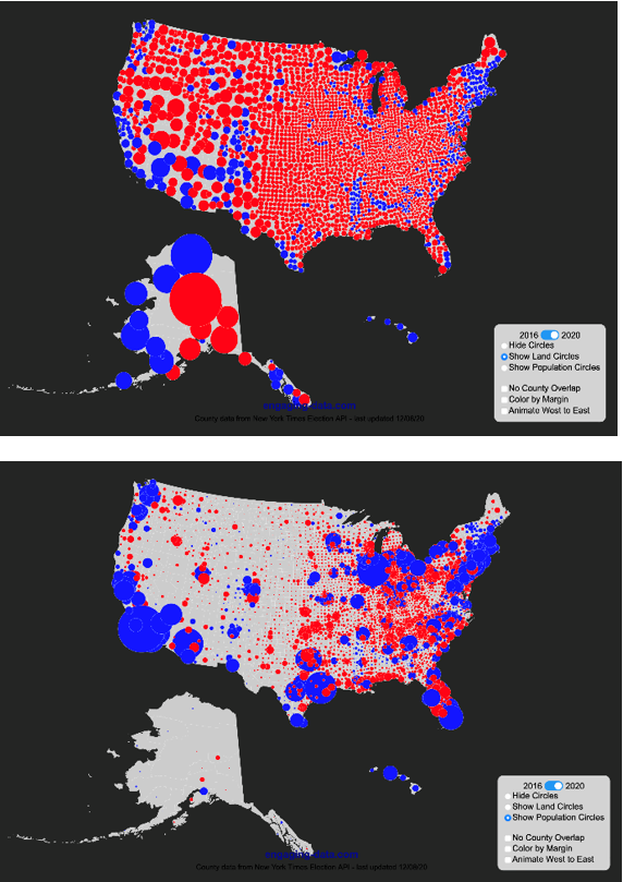
Image source: US County Electoral Map – Land Area vs Population, Engaging Data.
Telling dramatically different stories with data
There are many choices available when creating data visualizations—the type of chart or graph, the number of variables shown, the scales used and the use of colour. All of these factors can work together to tell dramatically different stories. Take this example of a visualization of the 2020 US presidential election results. While these two visualizations show the same data, they tell very different stories. The visualization on the left uses coloured circles, sized according to the geographical area to each voting region, whereas the map on the right uses coloured circles that are sized according to population of the voting region.
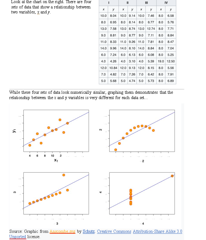
Image source: Graphic from Anscombe.svg by Schutz. Creative Commons Attribution-Share Alike 3.0 Unported license.
What's in the data?
In this example, we’ll look at Anscombe’s quartet, an example created by the statistician Francis Anscombe in 1973 to demonstrate the importance of graphic data when analyzing it. Look at the chart. There are four sets of data that show a relationship between two variables, x and y. While these four sets of data look numerically similar, graphing them demonstrates that the relationship between the x and y variables is very different for each data set...
Data literacy
We are frequently presented with Data and Information Visualizations online and in different publications, and it is important to understand how these visual representations can simplify the complexity of the data, or only depict a partial story. As such they can intentionally or unintentionally tell stories that are either incomplete or incorrect. In our data-driven world, it is important for just about everyone to have some degree of data literacy with respect to being able to read, understand, and critique visual representations of data. Full data literacy is the ability to read, work with, analyze and communicate with data—skills that also involve using software tools to transform raw numerical data into different visual forms.
Visualizing data
The process of creating Data Visualizations involves transforming numerical data into a visual form. In its numerical form, data is often saved and shared using spreadsheets—digital tables with rows and columns. These spreadsheets can be in a proprietary format such as Microsoft Excel, or in a plain text format such as CSV (Comma Separated Values). This raw data often needs to be formatted before being imported to a software application for visualization. This process ranges from simple to extremely complex depending on the nature of the data and the type of visualization. For example, Microsoft Excel is an application that allows for the storage and organization of data as a spreadsheet, but also includes a range of tools to view the data in graphs and charts. Other applications, such as Tableau, integrate tools that allow users to import data and create data dashboards to explore and compare data using different types of visualizations.
Quiz
Activities

In this activity, we’ll take a critical look at some Information Visualizations communicating Covid-19 statistics in the media.

Have a look at the article on "How Bad Covid-19 Visualizations Mislead the Public." Now think back on the steps involved with transforming data into Data and Information Visualizations and consider the following questions. Hopefully they will provide you with food-for-thought in your journey towards data literacy!
- Do you think that any of the examples in the article demonstrate an intentional misuse of Data and Information Visualization?
- Can you think of any Data or Information Visualizations that you have seen lately? Did the visualizations seem to draw conclusions by design?
- Do you think that data storytellers and information designers should provide more transparency with respect to their data sources and choices with respect to how they have chosen to represent data?

This activity should take about 10 minutes
Are you an undergraduate student participating in the FutureBound program?
After reviewing the content and completing the
activities for one of
the Things, you can complete a
reflection form
to have it count as one activity towards your
Digital Capabilities & Mindsets certificate!
Resources

Visual Capitalist
Visual Capitalist publishes and collates data visualizations, with a focus on business, economics, and technology.
See more
Data Storytelling and Data Visualization
A course on data visualization for Data Analysis and Data Science
See more
The Good, the Bad, and the Biased
Subtitle: "Five Ways Visualizations Can Mislead (and How to Fix Them)." [PDF] Szafir, Danielle Albers. Interactions, Vol. 25, no. 4, 2018, pp. 26–33. https://doi.org/10.1145/3231772
See moreReferences
Wikipedia. Data and Information Visualization. 2022
Nora Mulvaney, Audrey Wubbenhorst, and Amtoj Kaur. Critical Data Literacy: Strategies to Effectively Interpret and Evaluate Data Visualizations. Toronto Metropolitan University, 2022.
Wikipedia. Anscombe’s Quartet. 2020.
Stobierski, T. Bad Data Visualization: E5 Examples of Misleading Data. Harvard Business School, January 2021.
Engaging Data. US County Electoral Map – Land Area vs Population. 2020.
Wikipedia. Data Literacy. 2021
McCormick, B. H., DeFanti, T. A. & Brown, M. D. Visualization in Scientific Computing. Vol 21, no 6, ACM SIGGRAPH, 1987.
Wikipedia. John Tukey. 2022
Alice Park, Charlie Smart, Rumsey Taylor, and Miles Watkins. An Extremely Detailed Map of the 2020 Election. New York Times, 2021.
Robert Falkowitz. Information Visualization or Data Visualization? Concentric Circle Consulting, 2019.